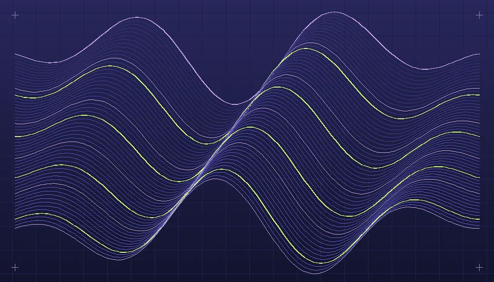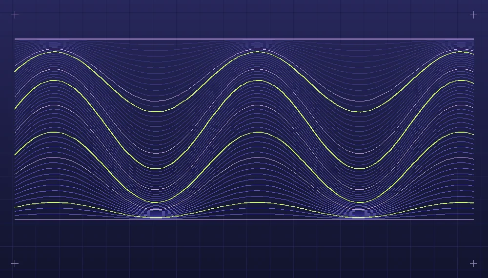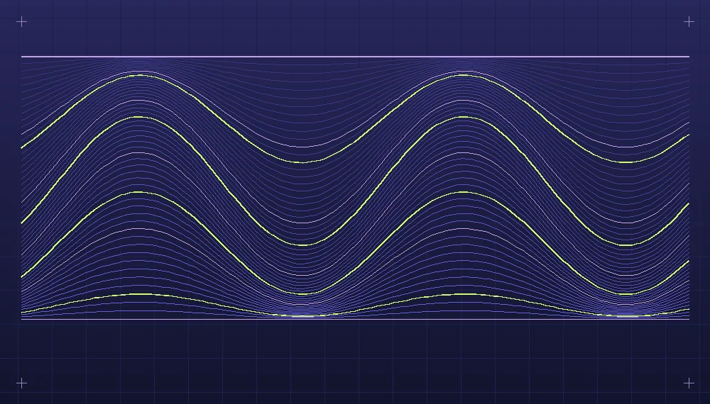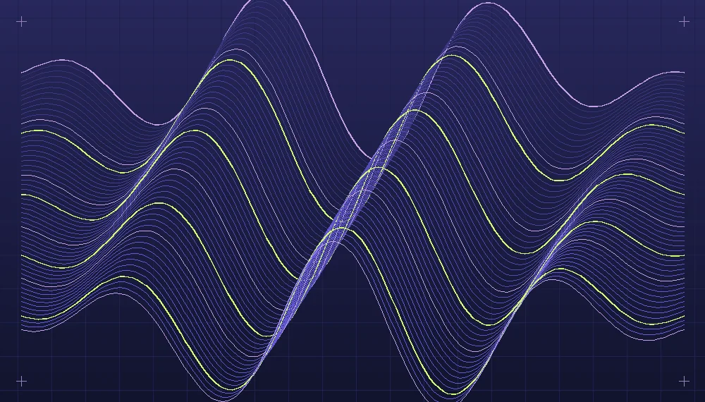
A line drawn by hand records a gesture. A line drawn by a program records a decision about position, direction, thickness and the relationship between successive points. That distinction matters when the aim is to produce artwork rather than a graphic demonstration of a formula. The line is a material with its own expressive possibilities, and the code supplies a way of working with that material repeatedly. A compelling image might be built out of nothing more than a few dozen parallel curves if the spacing, rhythm and proportions are considered carefully.
Begin with a field of lines
Prepare a rectangular canvas and fill its central region with evenly spaced horizontal segments. Leave some space at the edge rather than allowing the segments to touch all four sides. At this stage there is no need for a gradient, moving particles or multiple colors. It helps to view a simple field at the eventual print or screen size so that the weight of the marks is not judged on a misleadingly large working surface. In a small preview, a line one pixel wide can disappear; in a large print, closely spaced strokes may merge from a distance.
Give each segment an index and divide that index by the number of lines minus one. The resulting normalized value runs from zero at the first line to one at the last. Draw the horizontal position in the same normalized fashion, independently of the pixel dimensions. The advantage is that a change from a square to a wide canvas does not require inventing an entirely new rule. You can choose to keep the physical stroke width or scale it with the canvas. These are separate artistic choices, not consequences that should be left to the rendering engine.
A curve can have direction without an arrow
To disturb the straight field, displace the vertical position of each point according to a smooth curve. A sinusoidal displacement is a useful initial experiment because its amplitude and cycle length have familiar effects. Start with the same curve for every line. The field remains coherent, moving together like a group rather than a collection of unrelated waves. Then vary the amplitude gradually according to the line index. Some curves can remain almost flat while others bend dramatically. In this second arrangement the relative movement between neighboring lines begins to create an internal rhythm.
Direction is not only a question of whether a curve bends up or down. The amount of empty space between marks creates a sense of movement as well. If lines are crowded at one end and open out toward the other, the eye has an obvious change to follow. Crossings can make the movement more turbulent, though too many crossings may turn the image into a dense texture whose individual lines are impossible to trace. Render a version without intersections, then one with a small group near the center. Compare them before deciding whether crossings belong in the piece.
Related reading: From mathematical curves to graphic composition.
An envelope, a separate smooth function that controls the displacement, can confine the movement to a chosen region. Multiply the curve by a value close to zero near the edges and larger in the middle. This makes it possible to keep the beginning and end of every segment aligned while introducing variation in between. Alternatively, place an offset envelope toward the left or right to establish an asymmetrical focus. The envelope is often a more effective compositional control than increasing the wave amplitude across the whole width.
A practical line study
Imagine a canvas with sixty-four horizontal curves and generous blank margins. The first experiment uses equal line intervals and one thin stroke weight. Its purpose is to establish the visual ground against which later modifications are visible. The second version retains the dimensions, color and line count while varying the curve amplitude. Save both exports with their parameters. For the third version, keep the successful amplitude and change the spacing distribution so that the central lines sit close together while the outer lines retain more breathing room. It should become possible to identify the contribution of curvature and spacing separately.
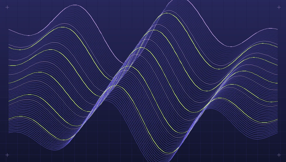
A fourth version might introduce a small number of heavier lines. Choose their positions in relation to the composition rather than selecting them at regular intervals automatically. A heavy stroke near the edge can frame the rest of the image. One near a transition in density can underline the point at which the field begins to open. If the thicker marks dominate every other visual relationship, reduce their weight or frequency. A deliberate distinction between primary and secondary lines is more useful than a sequence of arbitrary thickness values.
Once a successful structure emerges, introduce a limited palette. For a dark field, use a light structural color and perhaps a contrasting accent for selected traces. Give the accent a purpose within the movement of the lines. If a particular curve leads toward the focal region, its brighter color can make that path visible. The same accent sprinkled uniformly among the curves may interfere with the direction established by their geometry. Make a grayscale copy to check that important relationships do not disappear without color. This is a quick way to diagnose hierarchy independently of hue.
Framing and scale are compositional decisions
Generative artists sometimes keep every point inside the canvas so that nothing produced by their algorithm is lost. A complete diagram may be useful for explaining the system, but it need not be the finished artwork. Cropping an interesting portion of a line field can make the movement feel as though it continues beyond the image. Move the frame around the composition rather than starting by creating more elaborate rules. A small change in framing can reveal an area of contrast that occupied too little of the original canvas.
Check each candidate at two different sizes. At a reduced size, look for the overall direction, the relative weight of regions and the clarity of the silhouette. At the full size, inspect joins, aliasing, tiny gaps and abrupt changes in line width. Both views matter. A piece whose detailed curves reward close inspection can still feel shapeless from a distance. A clear thumbnail with poorly rendered edges may disappoint anyone who opens the full image. If the work will appear on varied backgrounds, inspect the actual surrounding colors instead of only the neutral working canvas.
For unusually dense drawings, experiment with rendering a high-resolution source and reducing it to the final presentation size. The resulting antialiasing may soften the thinnest strands, so compare a native-size render and a reduced derivative before selecting the export method.
Keep the rule visible in the collection
A collection of ten line studies can communicate more about a system than a single image if each piece explores a meaningful difference. Keep a few properties constant, such as the direction of the field or its background and stroke roles. Vary others in a controlled way, exploring changes of amplitude, distribution and framing. Arrange the pieces in an order that allows the viewer to notice those differences. A series with an identifiable rule can tolerate some surprising outcomes because the surprise has a context.
Record the values used for every chosen image. Include the line count, width, displacement rule, envelope and crop, along with the palette and random seed if the process uses random variation. This is more than an archival safeguard. Looking at the records of a good and a disappointing piece side by side often reveals which adjustment made the difference. Generative line work rewards slow observation between rendering attempts: the next useful change may be removing a group of marks, not adding another mathematical function.
Explore the implementation area: Artificial art and generative design.