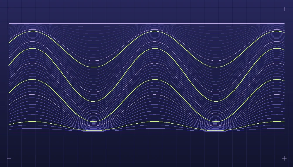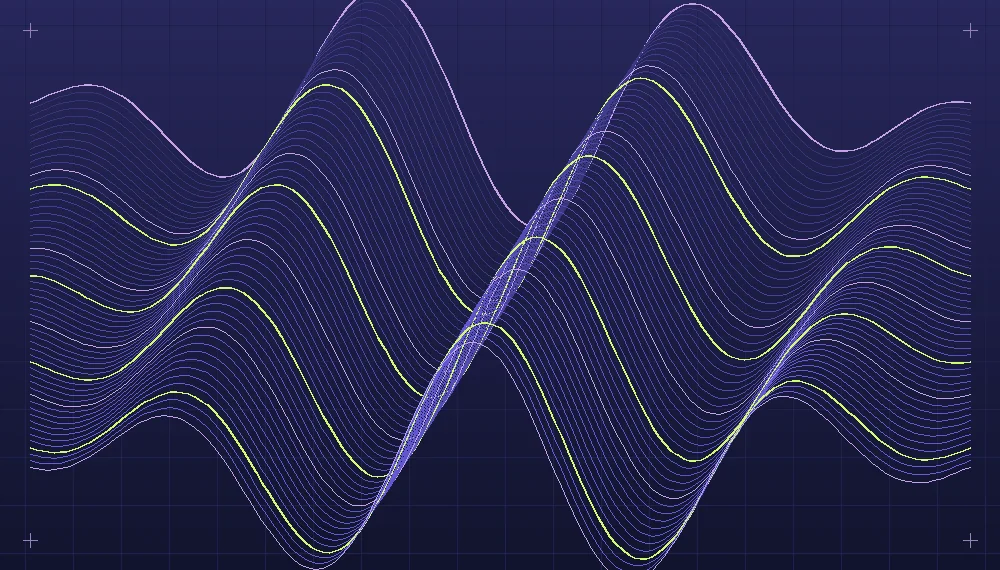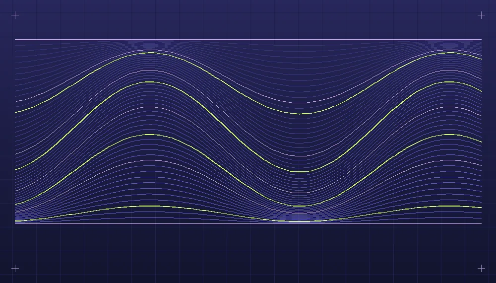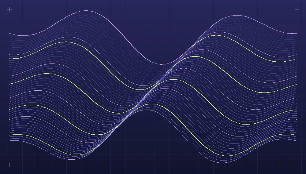
When a drawing algorithm produces a new arrangement each time it runs, the color system must work across arrangements as well as on a favorite example. Randomly choosing several hues from an attractive palette is not enough. A composition with a pale background and fine strokes needs a different balance from one with a dark ground and dense intersecting shapes. Palette design is the practice of assigning color to visual responsibilities, then testing those assignments over the range of outputs that the artwork can actually produce. The desired result might be restrained, lively or deliberately uncomfortable, but its color relationships should support that intention.
Name the roles before choosing the colors
Suppose a system draws groups of small curved shapes across a rectangular field. Instead of giving each shape an independent random color, begin with three roles: the ground, the main structure and a smaller set of accents. A second structural tone may distinguish neighboring groups. An optional quiet tone could occupy the spaces between them. It helps to give the variables descriptive names that correspond to these roles. The names become useful when you replace the colors with a different selection and want to compare how the same responsibilities are handled.
The ground is not just the absence of marks. It establishes the overall light level and influences how the other tones appear. A nearly black ground can make delicate pale lines visible and can give strong accents a luminous quality. A pale ground reveals the weight of dark marks and their relationship to open space. A middle-value ground can bring both lighter and darker marks into the composition, although that requires care to keep them distinct. Generate the simplest possible version of the artwork with the intended background and structural tone before increasing the palette size.
Contrast depends on proximity and coverage
A swatch sheet lets you compare isolated colors, but the actual image contains adjacent marks of different sizes. A tiny strip of bright yellow may be easy to distinguish on dark violet, while a group of fine yellow lines can disappear on a light background. A large flat area of the same yellow could dominate the composition. Compare representative uses rather than relying on a row of equally sized swatches. Render a few strokes, overlapping shapes and large regions against the proposed ground. Their relative scale and proximity will tell you more about the real composition than numerical color distance alone.
Inspect the value relationships without relying on hue. A grayscale export can help identify situations where two colors with very different hues are nearly indistinguishable in lightness. That may be perfectly suitable for a subtle color transition. It becomes troublesome when those colors were intended to separate two kinds of shape. If one group should form the primary structure, consider changing its value or coverage before introducing an additional hue. Sometimes slight changes to stroke width or the spaces between shapes make the original palette work better than a more dramatic color replacement.
Related reading: Curating a series of computational artworks.
Rather than generating arbitrary colors from numerical channels, define ranges around the selected roles. A structural tone might vary a little in lightness, while accents maintain a more stable value. When variation is important, consider whether the effect should be visible at the size at which viewers will see the work. Tiny changes between neighboring colors may create attractive close-up texture but have little effect in a small card. Larger shifts may produce a spotted surface that competes with the underlying geometry.
Give the accent an artistic job
Imagine a collection of line fields in which a few sharply bent strands direct the viewer's attention toward a central opening. One palette uses muted blue for most lines and a warm yellow for the selected bends. If the generator assigns yellow to every fifth line, there may be no connection between the highlighted positions and the opening. Instead, determine which lines are nearest the intended focus or carry the clearest curve. Assign the accent there, with a limit on how many marks can receive it. This keeps the highlight connected to the visual rule.
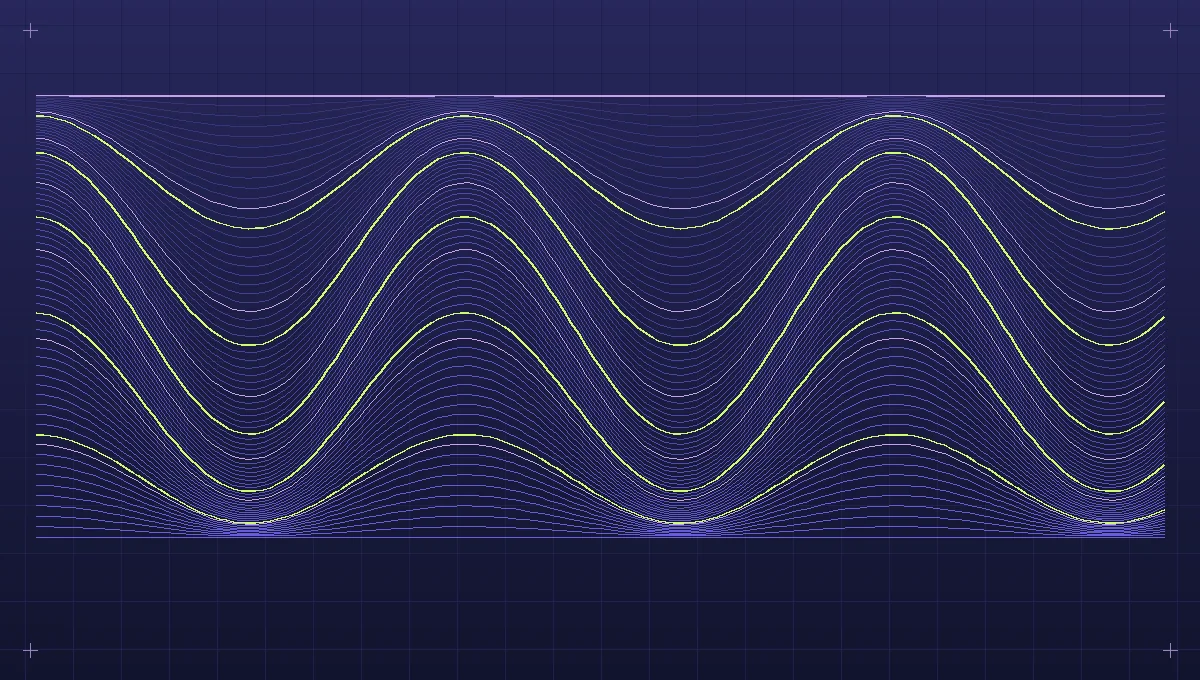
A different composition might reserve an accent for a contrasting group at the edge, creating an imbalance that invites the eye to move across the field. In that case a central highlighting rule would produce the wrong result even with the same colors. Write one sentence describing the accent's responsibility for the artwork and translate that description into a selection rule. The rule could depend on position, size, direction or a small number of hand-selected objects. It need not always use randomness. Some of the strongest distinctions arise when color placement is governed by the geometry rather than chosen independently.
Explore a palette using identical geometry
For a practical comparison, generate three compositions that represent common outcomes of your system: a balanced field, a crowded field and one with a prominent empty region. Save their seeds or parameter records so they can be drawn again. Choose several palette candidates and export each geometry with all of them, keeping dimensions, placement, stroke widths and assignments identical. This separates changes caused by color from changes caused by a new arrangement. Place the resulting previews next to each other at equal sizes. A candidate that flatters the most orderly geometry might fail when many objects overlap.
A useful comparison might involve a dark palette with cool structural tones and a pale accent, a light palette with warm dark lines and a subdued accent, and a low-contrast palette aimed at creating a quieter texture. These need not all suit the same eventual publication. Observe the focal points in each rendering. Does the intended region receive attention? Do secondary marks remain legible? Are any large regions too dominant? Do overlapping objects produce unexpected hues or dark areas? Keep brief notes about these observations rather than selecting only the version that first looks appealing.
Review the same matrix at small and large scales. On the small version, check the silhouette of the composition and its broad value gradients. On a large version, look for transitions, close color interactions and the effect of translucent drawing operations. A thin stroke may occupy very few pixels in an exported thumbnail and become mixed with the ground through antialiasing. If the artwork will accompany text, evaluate the actual layout as well. A vivid palette can be effective next to quiet typography but distracting when competing with several other vivid images on the same page.
When randomness helps and when it weakens a palette
A collection with strict palette assignments can become repetitive when all of its pieces distribute color in similar proportions. Introduce variation deliberately: a few outputs can use more of the secondary tone, while others reserve almost all their marks for the primary structure. If the generator varies hue within a role, constrain the variation so that the role is still recognized. Choose limits using the comparisons rather than abstract preferences. Render the smallest and largest allowed changes to see whether the extremes remain meaningful.
There is no requirement for every variation to use all available colors. An understated monochromatic composition may provide a useful pause in a larger series. Some works may have an accent so small that it is visible only in the final large presentation. Save the palette alongside each selected composition, including how the roles were assigned. A later artist or maintainer should be able to distinguish the exact color choices from the conditions under which they were used. A well-designed palette is a small set of reproducible decisions, capable of supporting both visual coherence and unexpected detail without turning every generated output into a different visual identity.
Explore the implementation area: Artificial art and generative design.