The most useful digital art portfolio is not necessarily the one with the largest inventory of work or the most prominent animations. It gives visitors a clear way to understand the artist's individual pieces and the relationship between them. Artwork can already contain complex geometry, strong color and intricate textures. Navigation and layout should make those features easier to appreciate rather than compete for the same attention. A portfolio is a presentation system around the work, and the choices about grouping, image sizes, reading order and supporting text can substantially change how the work is perceived.
Decide how people should encounter the collection
A visitor arriving from a search result may open an individual project without seeing the home page. Another visitor may deliberately browse all of an artist's work from the collection index. Give both paths a clear structure. A project page needs an identifying title, a meaningful image and enough context to understand why the piece belongs in the collection. It also needs a way to reach the rest of that collection. The index should make it possible to compare the pieces before requiring many page loads or interactions.
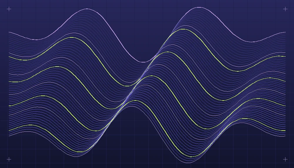
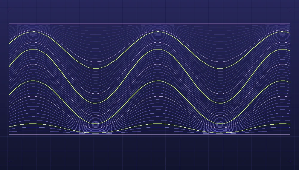
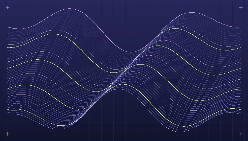
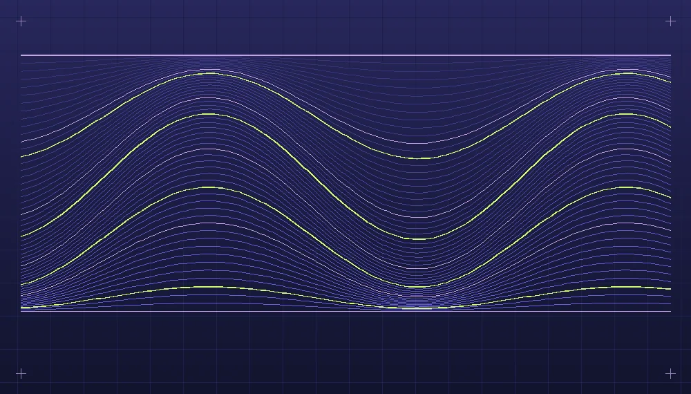
Group works according to relationships that a viewer can recognize. A generative artist may have one series based on mathematical curves, another based on modular geometric forms and a third exploring animation. The group names should identify the visual or conceptual connection. Avoid organizing every small technical variation as a new series, which leaves the index too fragmented to navigate. If two groups require lengthy explanation before their difference is apparent, consider whether they belong on one collection page with smaller subsections.
Use layout to distinguish browsing from viewing
The collection index is a browsing surface. A flexible grid with consistent preview proportions allows many pieces to be considered together without imposing fixed sizes on the works themselves. Project pages have a different job: they give a selected piece room. A single vertical artwork may look better in a contained frame with space at the sides rather than stretched across the full browser width. A wide line study might benefit from a generous horizontal image area. Establish both a preview convention for the index and a presentation convention for each project; they need not use identical cropping.
If works have varied dimensions, deliberately decide how their index previews should be made. A central crop may remove an important part of an asymmetrical piece, while padding every preview with a large uniform border can make small images difficult to identify. One option is to create dedicated crops for the index and link them to complete views. Record those crops separately from the original files. Inspect the previews side by side with the complete pieces to ensure that they offer a reasonable indication of the artwork rather than misleading fragments.
Related reading: Developing movement through simple animation rules.
Comfortable spacing is more important than accumulating borders and elaborate card treatments. A consistent distance between projects allows each thumbnail to be understood independently. Within an item, the image and its short label should sit close enough to be read as a unit. Between groups, a larger interval and a plain heading can establish the change in subject. Avoid adding many repeated decorative elements, shadows and badges around the art, especially when those additions resemble features already present in the compositions themselves.
Write captions that add information without interpretation overload
A concise caption can identify the name of a work, its series and information about the process. For a procedural piece, a note about the rule used or the parameter explored can help viewers understand why it resembles other pieces. That information should be specific to the work rather than promotional language applied to every image. A longer process description is appropriate if the project develops over several stages. Place it where readers can choose to read it after seeing the main image; avoid forcing every visitor through an extensive explanation before presenting the artwork.
Alternative text deserves a separate decision from captions. Its purpose is to communicate the relevant visual information for someone who cannot see the image. Describe prominent forms, direction, contrast or structure in context. A visible caption can supply the title or production note without needing to repeat everything in the alternative text. Decorative images used only to create atmosphere may not require a detailed description, while the artwork itself is central content and merits one. Check that links to enlarged images have clear names rather than relying on an unlabelled icon.
Prepare images for the way the site serves them
An artist's working export may be large enough for printing and include details that cannot be seen in a small preview. Delivering that file for every card imposes unnecessary loading costs. Keep a high-quality source separately and prepare previews at dimensions appropriate to their displayed sizes. Larger derivatives can be available on project pages. For intricate line work, inspect the result after compression at the target display size. Strong thin edges and smooth color transitions deserve particular attention. A file that appears acceptable in an image editor at a large size may show distracting artifacts after reduction.
Specify the dimensions or aspect ratio for images in the page markup or layout rules so that space is reserved before they arrive. This makes the page structure more stable while loading. Delay fetching images that lie well below the initial viewing area if the delivery system supports it, but do not hide the initial artwork behind a long loading animation. Keep the text headings and ordinary navigation links present independently of image availability. Someone browsing with network difficulties should still see the names of the projects and know how to reach the selected page.
A practical project-page review
Consider a small portfolio of eighteen generative line studies divided into three collections. Build the index with six smaller previews per collection and a descriptive heading for each group. A project page contains the full composition, a two-paragraph explanation of the rule, an optional detail crop and links to nearby studies. Test the page first with an unusually wide composition, then a tall one. Inspect both on a narrow viewport and a broad desktop. The artwork should retain its appropriate proportions, captions should remain attached to their figures, and links should be available without obstructing the image.
Next, test a slower connection and check whether the initial artwork becomes visible before thumbnails further down the page. Navigate through the collection using only the keyboard, then with larger text settings. Confirm that the current project and group remain understandable even if images are absent. A page that succeeds during these ordinary checks is likely to be easier to maintain, because the presentation rules are independent of a particular perfect sample.
Avoid forcing every project to open inside an overlay that lacks a durable address. An ordinary detail page gives a piece a place of its own, allows someone to return to it and supplies a predictable way back to the collection. An optional larger viewer can supplement that structure.
Allow the collection to change
A portfolio may grow through new projects or a revision of earlier series. Plan its addresses and navigation so that an individual work can remain accessible when a collection changes order. Keep descriptive records for important images, filenames and display decisions. A deliberate move to a new group should not silently lose the context that made an earlier link useful. The finished portfolio need not be visually silent: typography, color and interaction can be expressive. Their role is to frame the artwork, help viewers explore the relationships and leave enough space for individual pieces to communicate on their own.
Explore the implementation area: Artificial art and generative design.